PacBio PRISM 2026: Color the Future of Genomics
Partnering with PullSpark and PacBio to build a usable global event ecosystem and visual playbook—without losing the flagship, future-on-stage feel.
00
Problem
PacBio PRISM is a rare platform where science, business, and brand all share the same room—a flagship global series that’s part conference, part roadshow, part internal rallying point. As it expanded to Barcelona, San Diego, and Fukuoka, the risk grew: if each city improvised its own version, the brand could quietly splinter. PullSpark, leading strategy and production, brought me in as Senior Art Director and Creative Lead to solve a familiar tension: giving regional teams real autonomy while preserving one unmistakable, high-fidelity PRISM identity. The challenge wasn’t just making something beautiful once—it was designing an ecosystem resilient enough to survive handoff after handoff without drifting into “good enough.”
Solution
We built a conference-in-a-box that still felt like a living, breathing flagship brand. Partnering with PullSpark, I led visual development and editorial architecture for the PacBio PRISM 2026 system—from logo bumper and show opener keyframes to a fully articulated event playbook and presentation templates. The goal was a spectrum-driven language that could be both cinematic and deeply practical, working as a hero moment on a 60-foot LED wall and as a last-minute template on a regional marketer’s laptop. Every layout, gradient, and motion path was designed against real in-room constraints—screen sizes, AV limitations, regional resourcing, and the way a harried operator actually hunts for “that one slide” seconds before a session.
The Execution
01. The 2026 Global Event Playbook: One Vision, Every Venue
The playbook became the spine of the whole system—the place where we could say, in plain language and in considered visuals: this is what PRISM looks like, how it behaves, and where you are free to adapt it.
I led art direction and editorial structure for the 2026 Global Event Playbook, anchoring everything on the line “Color the Future of Genomics” and the PRISM spectrum. Those vertical bands of color weren’t just a graphic flourish; they were a way of making the brand’s promise visible at a glance. Page after page, the gradients act almost like a narrator: quietly connecting GOALS & AIMS, ASSET KIT, and LOGO USAGE into a single, coherent experience rather than a collection of policy pages.
The layout treated operational content—pre-event checklists, AV flows, escalation paths—as first-class design citizens. Typographic hierarchy, white space, and spectrum-based section markers made it possible for a regional events lead to get what they needed quickly, while still feeling like they were holding something considered, not just a wordy instruction manual.
Together with the broader production team, we were explicit about what was flexible and what was not. Regions could bring their context through localized PRISM logos and speaker content, but foundational assets—the opening video, logo bumper, projection screen graphics, and core slide templates—were locked. You don’t future-proof a global event by encouraging everyone to improvise; you do it by making the right choices feel obvious, usable, and ready.
02. Logo Bumper: A Concise Brand Signature
If the playbook was the spine, the logo bumper was the pulse—short, repeatable, and unmistakably PRISM.
I developed multiple animation directions and keyframe sets that explored different ways the spectrum might come to life: a single line blooming into a fan of color, ribbed gradients that gradually cohere into letterforms, text slowly emerging from a field of moving stripes. Each exploration wasn’t just about motion for motion’s sake, but about asking: how does PacBio’s world of complex, precise genomics research show up as color, rhythm, and type on a screen?
The final MP4 balanced restraint with energy. The PacBio and PRISM marks resolve cleanly and legibly, even on less-than-ideal projectors. The spectrum moves with intent rather than chaos, signaling a brand that is confident enough to be expressive without becoming noisy. Used between speakers and at key transitions, the bumper became a kind of visual punctuation—one that local teams could drop in without second-guessing frame rates, file formats, or brand fit.
03. Show Opener: Framing the Emotional Arc
In close collaboration with PullSpark’s narrative and production leads, I shaped the PRISM show opener through a series of keyframes that sketched out the event’s emotional journey long before a single second of final video was rendered.
We began with mystery and atmosphere: abstract light, macro surfaces, and a sense that something is about to be revealed rather than immediately explained. From there, the frames moved into a “moment in time”—scientists at work, instruments humming, a complex world rendered in overlapping data, environments, and faces. The language of curiosity, courage, and boldness wasn’t treated as a tagline, but as a rhythm: curiosity leaning in close, courage stepping into the unknown, boldness widening the frame to show the global impact of what’s happening in the lab.
Those stills became the shared reference point between PacBio, PullSpark, and post-production partners. They answered questions like: how much color is too much? When do we let type take over the screen, and when do we let imagery breathe? Where does the logo appear, and how quickly? By locking the grammar of the opener at the keyframe level, we gave the execution team room to move while keeping the brand’s emotional center of gravity intact.
04. Pre-Roll Graphics: Operational Moments, On-Brand
Pre-roll is where events often quietly fall apart visually: a default countdown timer here, a random Wi‑Fi slide there, a well-meaning but off-brand welcome graphic from an AV tech who had ten minutes to “make something nice.”
We treated these so-called utility moments with the same care as the hero assets:
— Welcome slides that gently pull you into the spectrum rather than shout.
— Countdown layouts where time and agenda remain legible against rich gradients.
— Wi‑Fi screens that make the act of connecting feel like a continuation of the brand rather than a break from it.
Each direction played with different compositions of the PRISM palette, line structures, and typographic scales, but they all deferred to a single principle: at 30 feet wide, a room full of people should be able to see exactly what they need and also feel like they’re still inside the PRISM experience.
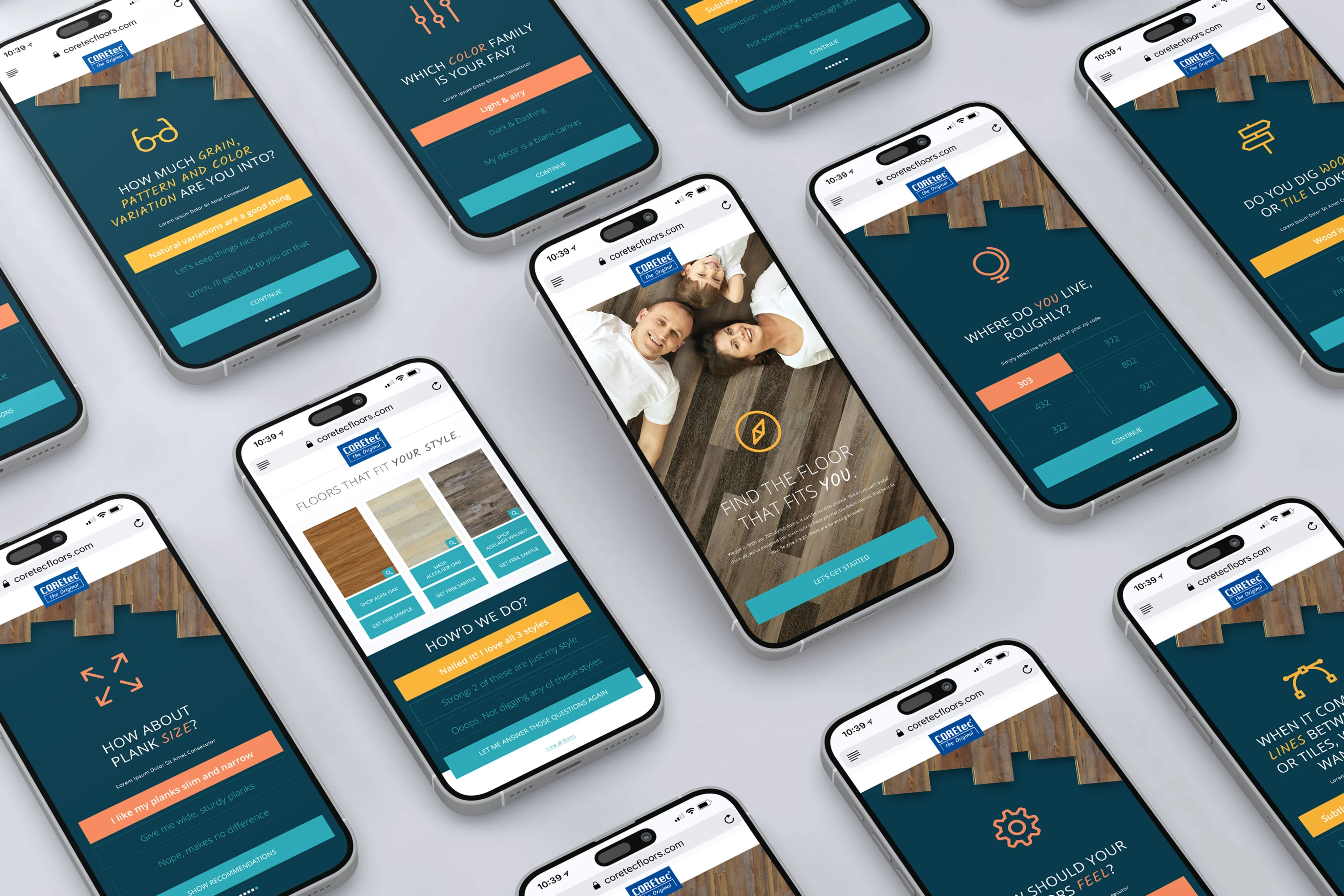
05. Presentation Template System: Speaker-Ready, Brand-Safe
No matter how polished the main stage looks, if speaker decks drift, the audience feels it.
I explored multiple presentation template directions with PacBio and the event team to find that balance between expressive and durable. Direction One leaned heavily into vertical spectrum bands and generous photo spaces; Direction Two focused more on dark, grid-based fields with light emerging from a single point; others played with different relationships between color, type, and image.
Out of those explorations came a final content deck system: title slides, quote slides, short-form content layouts, big-picture idea frames, image-led pages, and closing moments. Each template was tested with real talk titles, multi-line scientific descriptions, and faux data visualizations to make sure it could handle the messiness of reality—overlong titles, last-minute speaker swaps, and the inevitable “can we add one more bullet?” request.
The result for regional teams was not a blank canvas, but a highly considered toolkit: a set of slots to fill—name, title, company, headshot, core idea—inside layouts that already did the heavy lifting of hierarchy and brand integrity.
06. Visual System Governance: Guardrails Without Handcuffs
A spectrum this expressive can easily become unruly if not paired with equally clear rules. Within the playbook, I articulated a visual governance layer that sat on top of the assets and said, in effect: here’s how to keep this beautiful.
That meant:
— Defining logo clearspace based on the “O” in PacBio, so spacing becomes objective rather than opinion.
— Documenting full-color and one-color reverse logo options for light and dark backgrounds.
— Showing regional PRISM logo variations that swap in local motifs while preserving the core structure of the wordmark.
And just as importantly, illustrating incorrect usage: distorted logos, illegible overlays on busy patterns, drop shadows, outlines, or playful rotations that might feel “fun” in isolation but erode trust when multiplied across dozens of events.
These weren’t scolding rules; they were a way of inviting regional teams into the craft, giving them enough understanding of the system that they could spot problems before brand or events teams ever had to intervene.
Impact
By the time PacBio PRISM 2026 rolled out across Barcelona, San Diego, and Fukuoka, the combination of a unified visual system and tightly integrated production meant that local teams weren’t being asked to reinvent the wheel—they were being handed a finished vehicle with clear instructions on how to drive it.
They had:
— A 2026 Global Event Playbook that spelled out what to use, when, and how, in language that felt practical rather than punitive.
— Ready-to-run MP4s—opening video, logo bumper, pre-roll graphics—that behaved consistently across AV environments.
— A speaker deck system that allowed complex scientific stories to live inside a coherent, accessible, and distinctly PRISM visual language.
— Logo standards and regional guidelines that welcomed local flavor without sacrificing global recognition.
The real measure wasn’t just that everything looked good on screen (though it did), but that—from the main stage in San Diego to regional rooms across Europe and Asia—PRISM felt like one continuous experience. The colors carried; the typography held; the rhythm of the show—those quiet beats before the lights go down, the logo resolving between sessions, the final slide thanking the room—felt intentionally part of the same story.
Within that shared framework, the collaboration with PullSpark, PacBio, and regional teams became less about putting out fires and more about stewarding a living system. The work wasn’t just about coloring the future of genomics once; it was about giving everyone involved a way to keep coloring it, event after event, without ever losing the thread.
From here, the most honest way to understand PRISM is to see it in action. First up are the motion pieces—the logo bumper and show opener—that show how the spectrum, type, and pacing work together to carry a room from quiet anticipation into full-color momentum. Below that, a series of frames, playbook spreads, and templates break the system back apart again, revealing the process, guardrails, and final assets that make those moments repeatable across cities, teams, and venues.
Logo bumper: A concise brand signature that turns the PRISM spectrum into a repeatable, on-brand beat between moments.
Show opener: A narrative sweep that pulls the room from curiosity into full-color conviction about the future of genomics.
Year
2026
Timeframe
68 days
Client
PullSpark / PacBio
Category
Art Direction, Experiential
01

02

03

04

05

06

see also