From Strategy to Three Living Brand Directions: HEART Lab Brand Development, Part Two

In the last post, I walked through how the HEART Lab branding project started long before any logo sketch—by choosing a team lead, defining goals and anti-goals, and building a discovery process that actually reflects their world.
This round is where that strategy starts to become visible—but we’re still intentionally not designing “the logo” yet.
Instead, this phase is all about mood boards: focused, visual prototypes that let us test tone, color, and voice quickly before we commit serious time to a single direction.
Why Start with Mood Boards?
There are infinite ways to solve any design or branding request. If we jump straight into building a polished identity system, we’re making a big bet on one interpretation of the brief—and every revision after that gets slower, more emotional, and more expensive.
Mood boards give us a faster, lower-stakes way to explore how HEART Lab could show up, using concrete building blocks without over‑investing in final execution.
In this round, each direction includes:
— A headline and body copy style that hints at voice and hierarchy
— Font pairings that map to the lab’s mix of rigor, warmth, and accessibility
— An email signature / business card treatment to test professional presence
— A text lockup of the lab name to feel out structure and emphasis
— Accent graphics and photography styling that set the emotional temperature
— Color pairings that explore different emotional and conceptual lanes
By keeping everything at this “mood plus key ingredients” level, we can quickly see what feels aligned—and just as importantly, what doesn’t—before we start developing logos or building full environments.
Why Three Directions?
Because there are endless ways to solve a brief, my job is to narrow the field down to a small set of strong, contrasting options that:
— All honor the strategy and constraints
— Explore clearly different emotional and visual territories
— Make it easier for the team to respond with clarity instead of vague preferences
Three directions are enough to show real contrast without overwhelming feedback:
— The Relational Embrace: HEART Lab as a soft, intergenerational sanctuary
— The Radiant Insight: HEART Lab as a vivid, illuminated source of understanding
— The Equitable Foundation: HEART Lab as a structural pillar for community health equity
So when I say “none of them is the logo yet,” what I really mean is:
Each mood board is a partial but intentional world. It combines headline and body treatments, type pairings, color, photography, and accent graphics into a coherent impression—but it stops short of claiming, “This is the final identity.” Instead, each one is a test: If this were our world, how would it feel to live here?
The goal of this step isn’t to crown a winner. It’s to figure out which world feels most honest, useful, and sustainable for HEART Lab to inhabit going forward.
Direction 01: The Relational Embrace
The first direction, The Relational Embrace, imagines HEART Lab as an intergenerational sanctuary—a place where complex emotional experiences land softly and are held with care.
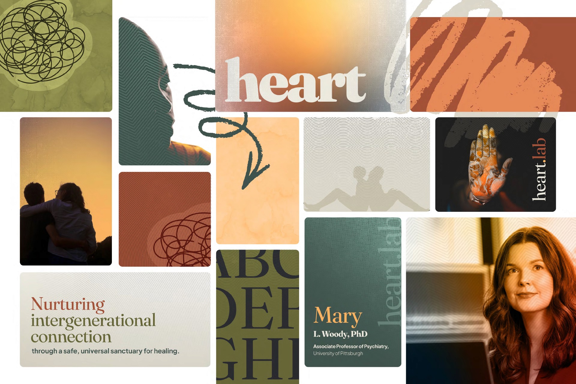
Color and tone
This route leans into grounded, human warmth: muted oranges, soft creams, and gentle greens. The pairings avoid anything overly sugary or high-contrast; instead, they sit in that “quiet sunlight” space that suggests safety and calm. Texture and subtle variation keep it from feeling flat or clinical.
Type and hierarchy
Headlines feel present and steady—blockier, grounded letterforms that carry weight without shouting. Body copy is more neutral and readable, letting the content breathe. The pairing says: we’re serious about what we do, but we’re not here to intimidate you.
Voice and positioning
Copy in this direction emphasizes togetherness and care:
“Nurturing intergenerational connection through a safe, universal sanctuary for healing.”
The voice avoids jargon and sits close to everyday language. Even in the email signature and business card treatments, there’s a sense of “person‑first” rather than “institution‑first”: you feel the human behind the title.
Accent graphics and photography
Accent shapes are organic and textured—gestures that feel almost hand‑touched rather than purely geometric. Photography centers close, relational moments: an embrace, a gentle gesture, faces that are present but not performative. Combined, these elements test the boundary between warm and too‑soft for a research lab.
Direction 02: The Radiant Insight
If The Relational Embrace is about being held, The Radiant Insight is about being lit up—bringing clarity, motion, and relevance to the lives of teens and their communities.
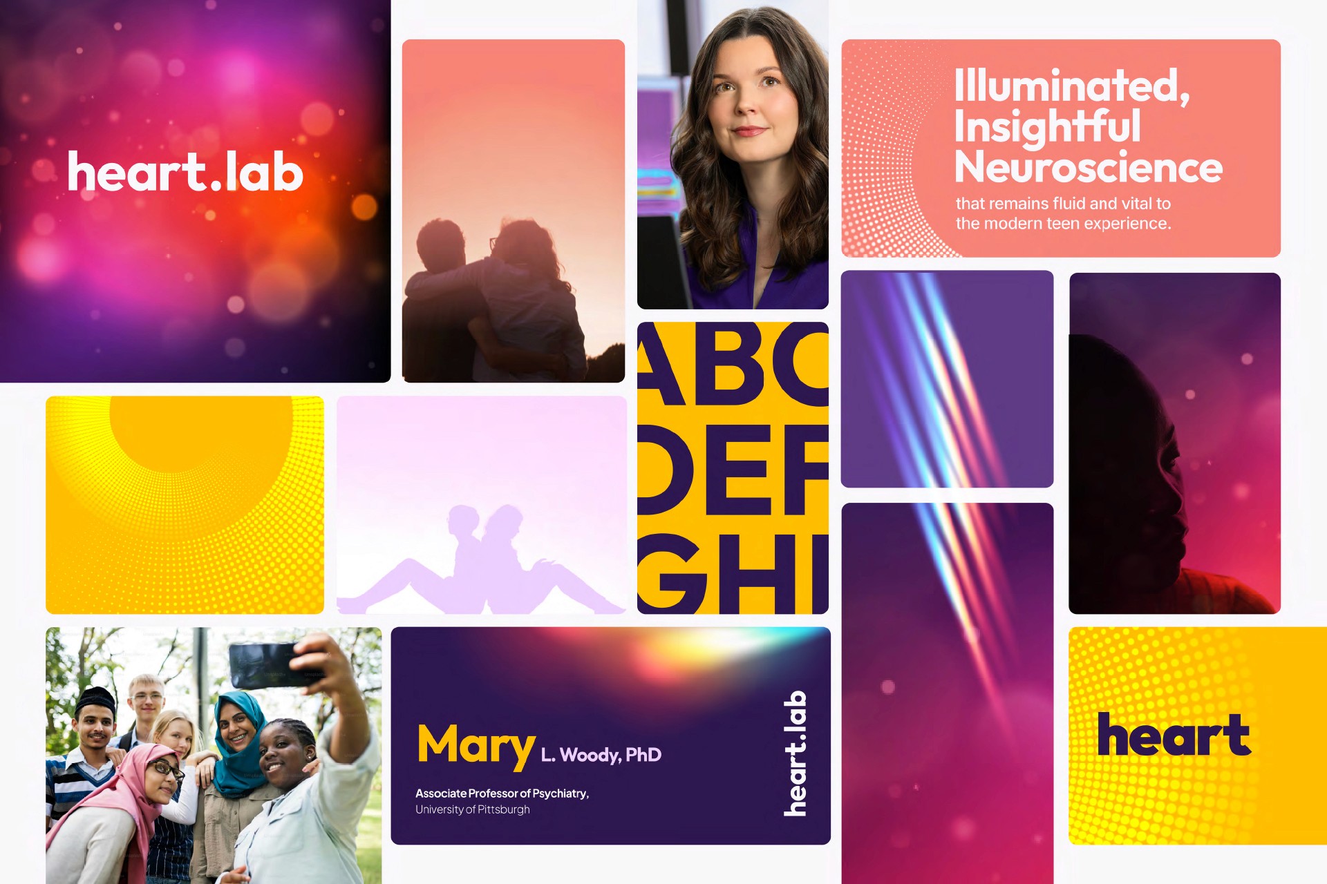
Color and tone
This direction moves into more saturated, high‑energy pairings: warm oranges into deep purples and magentas, with light effects and gradients. The combinations feel vivid and contemporary, more like “evening city lights” than “hospital corridor.”
Type and hierarchy
Headlines lean a bit more modern and assertive—clean sansserifs with enough character to feel distinct. Body text stays clear and legible but sits slightly lighter, so headlines and key phrases carry a sense of motion and focus. The pairing supports a voice that’s more “tuned in” to teen culture without feeling trendy for its own sake.
Voice and positioning
Here, the language steps up the energy:
“Illuminated, insightful neuroscience that remains fluid and vital to the modern teen experience.”
The voice is curious and forward‑moving—still approachable, but with a bit more velocity. In the business card and email signature, this direction feels like someone who’s just as comfortable in a research conference as they are speaking on a youth mental health panel.
Accent graphics and photography
Accent elements include light streaks, gradients, and soft glow effects that hint at both neural activity and digital life. Photography centers teens and young people in motion—smiling, interacting, existing in contemporary spaces. Together, these pieces test how much energy and “nowness” we can bring in without compromising trust or a sense of safety.
Direction 03: The Equitable Foundation
The third direction, The Equitable Foundation, pulls the camera back to focus on systems, community, and long‑term change.
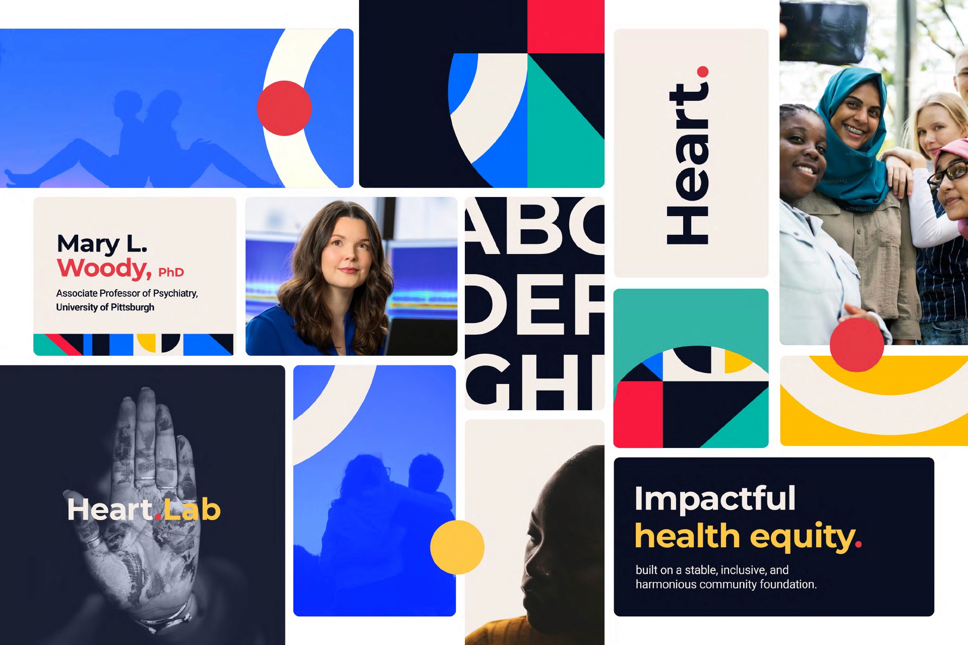
Color and tone
Here, the palette anchors in deep blues and teals, with deliberate hits of red, yellow, and green. The pairings feel more institutional in the best sense of the word—stable and trustworthy—but the accents keep it from sliding into bureaucracy. It says: we’re part of the infrastructure for health equity, not just a single lab in isolation.
Type and hierarchy
Headlines are bold and structured, leaning more into geometric or condensed forms that echo civic or advocacy design. Body text is straightforward and utilitarian, supporting longer explanations about impact and systems. The combination says: we do serious work with real‑world consequences.
Voice and positioning
The core phrase grounding this direction:
“Impactful health equity, built on a stable, inclusive, and harmonious community foundation.”
The voice can comfortably hold language like “equity,” “infrastructure,” and “foundation” without feeling abstract. Even in something as small as an email signature or business card, this direction positions HEART Lab as a partner in broader coalitions and networks.
Accent graphics and photography
Accent forms are more geometric and overlapping—circles, blocks, and arcs that hint at systems and interconnected parts. Photography highlights groups and community scenes—women and girls together, multi‑generational gatherings, people in shared spaces. This board tests how strongly HEART Lab can identify with movement and community infrastructure while still clearly reading as a research entity.
Mood Boards as Intentional Constraints
Across all three directions, the ingredients are intentionally consistent:
— A way of styling headlines and body copy
— A set of font pairings
— A text lockup for the lab name
— An email signature / business card pass
— Accent graphics and photography styling
— Color pairings that define each world’s emotional lane
By swapping those ingredients in and out across three distinct concepts, we get highly specific feedback:
“These colors feel right, but this type feels too stiff.”
“This voice feels closest to us, but the photography here misses our communities.”
“This email signature feels like how I actually want to show up professionally.”
That specificity is where the time‑saving happens. We’re not arguing about vague adjectives—we’re adjusting dials on color, type, voice, and imagery before they’re baked into a full system.
Setting Up the Next Stage
Once the HEART Lab team has reacted to these three directions, we’ll choose one mood board as the primary foundation—with the option to borrow select strengths from the others.
The next round of proofs will then move from “mood” to three full branding directions that all live inside that chosen world:
— Tweaking and stress‑testing the chosen color palette
— Developing and refining the logo and wordmark inside this environment
— Building out core environments—like key layouts and scenarios—so we can see how the identity really behaves
In other words, this post marks the shift from exploring possibilities to building out a coherent system.
By investing in multiple mood boards up front, we dramatically reduce wasted effort later. When we sit down to develop logos or design environments in the next round, they won’t be arbitrary explorations—they’ll be the natural next step of a direction we’ve already tested for color, voice, structure, and emotional truth.
— Headshot of Dr. Mary L. Woody by Joshua Franzos, used with permission from the University of Pittsburgh.
Date Published
May 12, 2026
Reading Time
6 min